In the heart of Rushcutters Bay, just a stroll away from Sydney Harbour and the city, lies a 1960s apartment block that’s undergone a major glow-up—think of it as a home renovation show, but without the dramatic pauses. With only four studio apartments in the building, each one is a cozy 24 square meters of pure potential.
Originally, this apartment was a bit of a layout nightmare, with a corridor entrance that led to a combo kitchen-living-bedroom situation. You know, the kind of place where you could fry an egg while still in bed. But that setup had to go, because who wants to sleep next to last night’s dinner? So, the entire space was gutted, making room for a design that would have Marie Kondo nodding in approval.
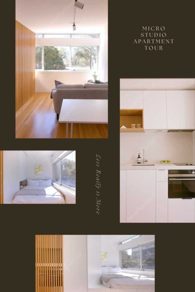
Table of Contents
Sleeping and Living: A Tug-of-War That’s Actually Fun
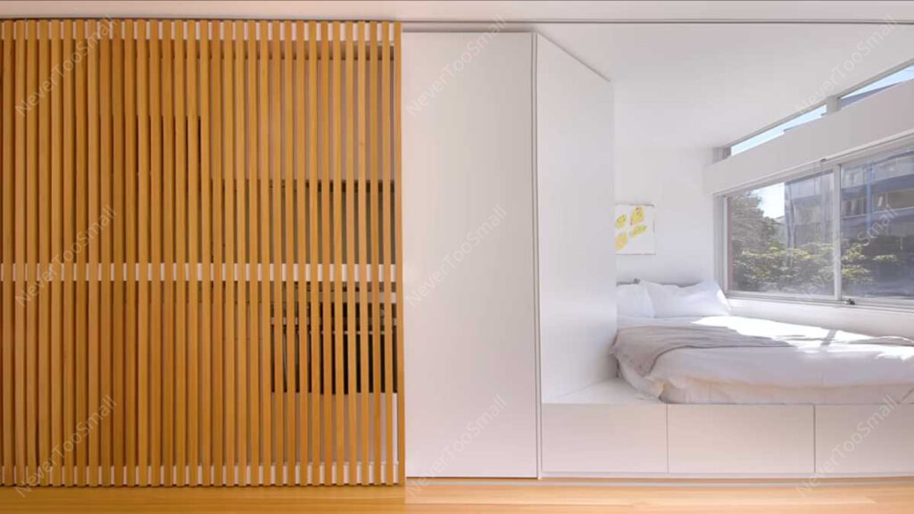
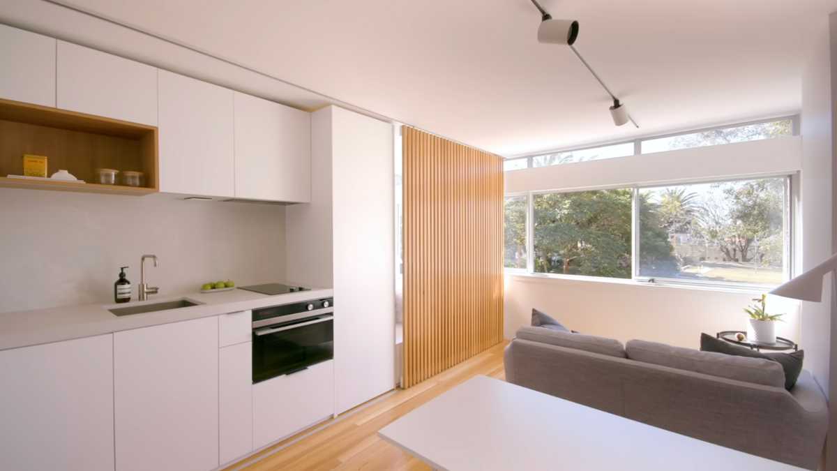
The secret sauce to this apartment’s new design is a sliding timber screen that acts like the Sorting Hat at Hogwarts, deciding the function of the space depending on the time of day. Need a place to binge-watch Netflix? Slide the screen one way to open up a spacious living area. Ready to crash? Slide it the other way to reveal a cozy bedroom nook.
This isn’t just a plain divider though—this timber screen doesn’t block out the light, making sure that both the living area and the bedroom stay bright and airy. It’s a feature that could make even the smallest room feel a bit more like a trendy loft rather than just a shoe box.
Storage? Check. Style? Double Check.
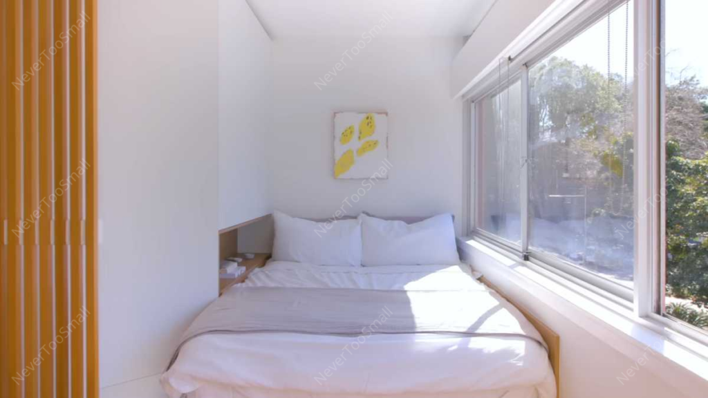
In a space this tight, every square meter counts. So, the bed’s been raised on a platform with built-in drawers—perfect for hiding away anything you don’t want your mom to see when she visits. There’s also a clever open shelf that doubles as a bedside table, complete with integrated lighting. Say goodbye to tripping over wires in the middle of the night!
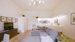
But the true pièce de résistance? Full-width windows. As soon as you walk in, these windows make sure that the entire apartment is flooded with natural light, creating the illusion of more space. And if that wasn’t enough, the joinery unit next to the bed is angled just right to catch and reflect that light, making the whole place feel bigger.
A Material World (Cue Madonna)
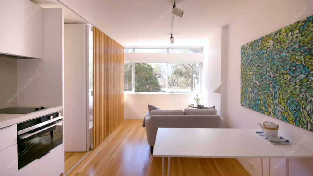
The materials in this apartment are all about keeping it minimal but chic. The timber screen and floor are both made from Blackbutt, a type of Australian hardwood that’s as strong as its name suggests. It adds warmth and softness to the space, balancing out the sleekness of other elements like the gray tiles in the bathroom. The combination of these earthy tones with concealed lighting gives off major “luxury spa vibes.”
Speaking of the bathroom, it’s hidden behind a door that also leads to a walk-in robe. Yep, that’s right—there’s an actual walk-in robe in this studio apartment. Together, these spaces flow seamlessly, making the apartment feel a lot more spacious than it actually is.
Kitchen Confidential
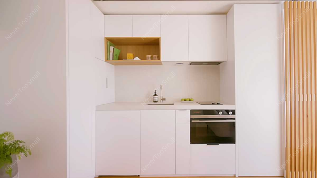
In a small space, the kitchen often gets the short end of the stick, but not here. Every inch has been meticulously planned out, from the fridge and oven to the dish drawer and narrow cutlery drawer. There’s even an appliance cupboard and a full-height pantry stack, because snacks are life.
The kitchen also sports a gray concrete benchtop and splashback that tie the whole room together. It’s the kind of design that would make a minimalist swoon—simple, functional, and absolutely Insta-worthy.
Sustainable Living: Because Why Not?
This apartment is proof that older buildings have a lot to offer—if they get a little love. Revamping a solidly built 1960s block like this one isn’t just about making it look good, it’s also a sustainable way to live. Reusing existing housing stock instead of knocking it down for something new means there’s less waste and a smaller environmental footprint. Plus, you get the charm of an old building with the perks of modern design.
In a city like Sydney, where real estate is as expensive as avocado toast, this apartment shows that small spaces can still have it all. All it takes is some creative thinking, a little demolition, and a sliding screen that’s as versatile as a Swiss Army knife.
Source: Never Too Small



Leave a Comment